How I redesigned Bundles and hit 69% adoption in 3 months
Overhauling a fragmented payment flow, working with product, engineering, and support to ship one outcome-driven screen that outperformed the legacy model.
TL;DR
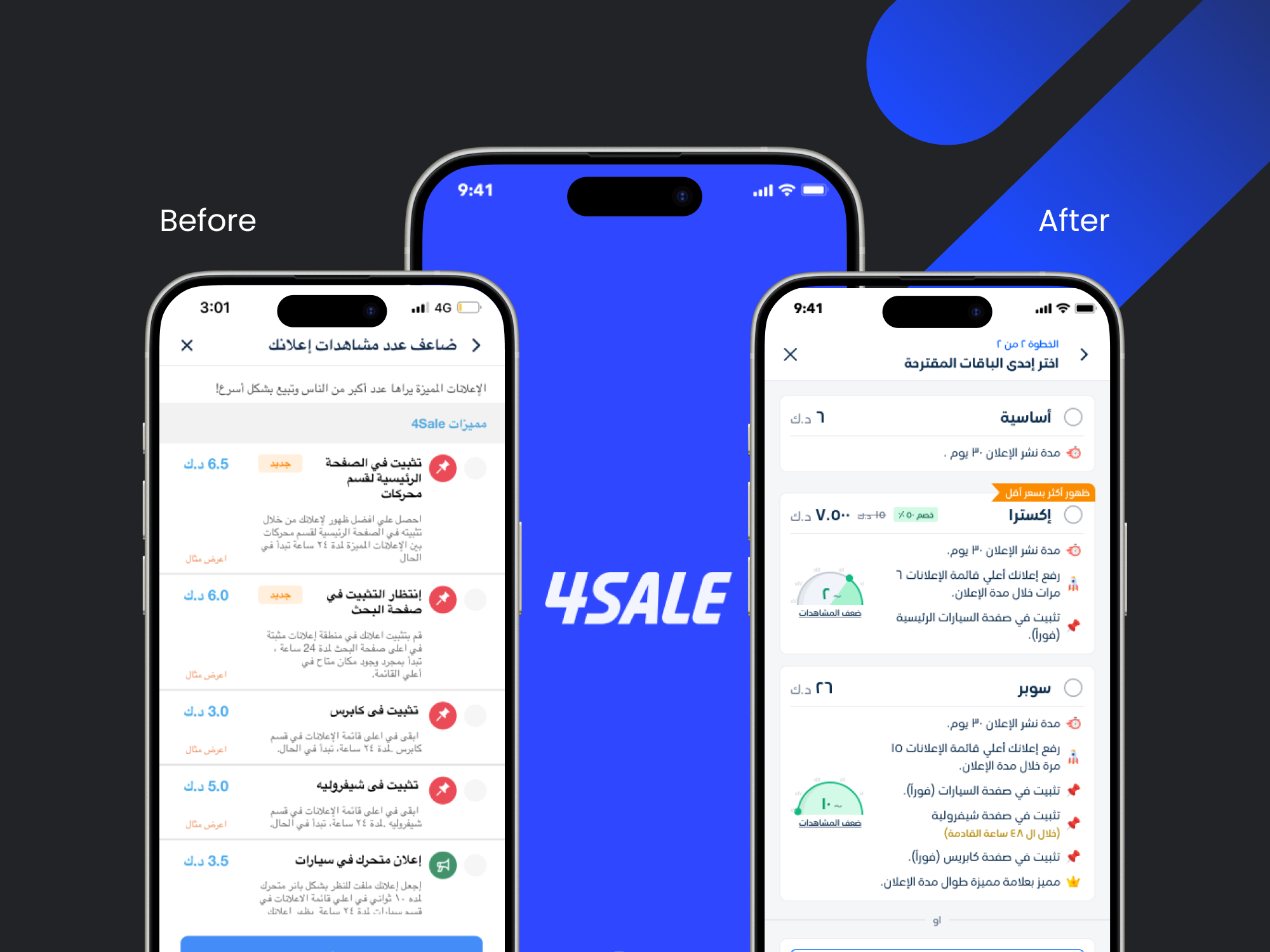
4Sale's payment flow forced users through two disconnected decisions, and most people skipped the one that mattered. I redesigned it into one outcome-driven screen, Bundles, lifting adoption to 69% and ARPU by 20% in three months.
Context
4Sale is the leading classifieds platform in Kuwait. Most of its revenue runs directly through the Post Listing Flow, which includes the steps a user takes to pay for an ad right after creating it.
The legacy flow split this process into two separate decisions:
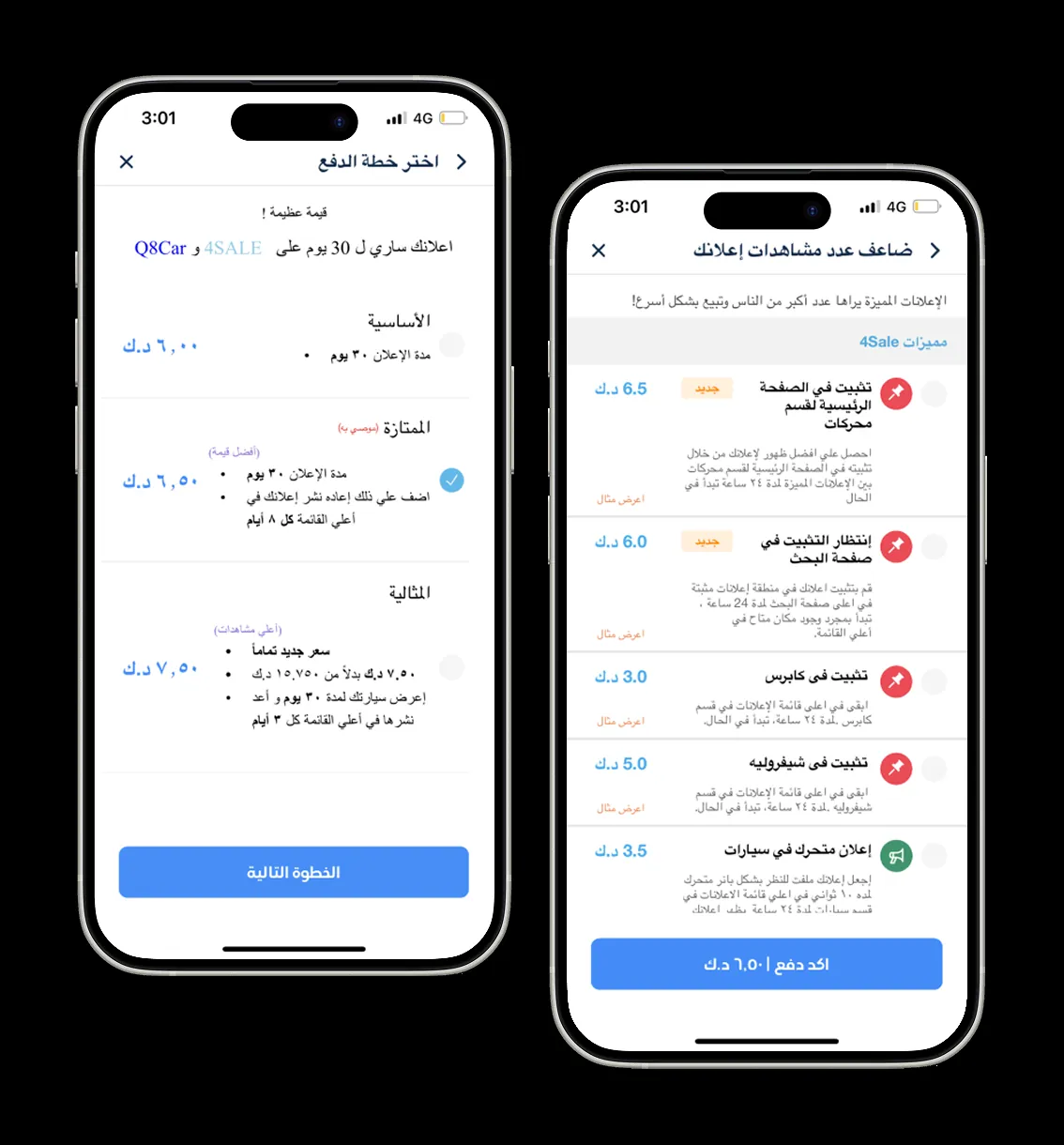
- Pick a Plan: Select the ad duration (usually 30 days) and standard refreshes.
- Pick Add-ons: Manually choose individual boosters like “Pin to Top.”
The problem
Watching how people actually used the flow exposed two issues:
- Add-on Blindness: Most users picked the cheapest plan and skipped Add-ons entirely, or only picked “Pin.” High-value features were invisible to the people who needed them most.
- A Scalability Ceiling: The Add-ons page had become a dead end. Every new paid feature on the product roadmap would land on a screen that users had already learned to ignore.
Left alone, this capped 4Sale's ability to grow revenue from anything beyond the cheapest plan.
Approach
1. Pinpointing the real bottleneck
Before jumping into designs, we combined behavioral observation with transactional data to understand why the flow was failing:
- Behavioral Friction: Usability sessions revealed high cognitive load. Users rushed through the primary plan selection and reflexively skipped the second Add-ons screen to finish the task quickly.
- The Value Mismatch: Data showed items on 4Sale typically sell within 4 to 10 days. Yet the legacy plans focused on 30-day durations. Users were paying for time they did not need, rather than the visibility that actually helped them sell faster.
How might we redesign the payment experience to be outcome-based instead of à la carte, in a way that reduces friction, lifts add-on adoption, and increases average revenue per user?
2. Strategic alignment and workshop
We ran a strategy workshop with the Product team to reframe the monetization structure. Instead of asking users to configure technical features line by line, we grouped features by the outcome and visibility level the user wanted to achieve:
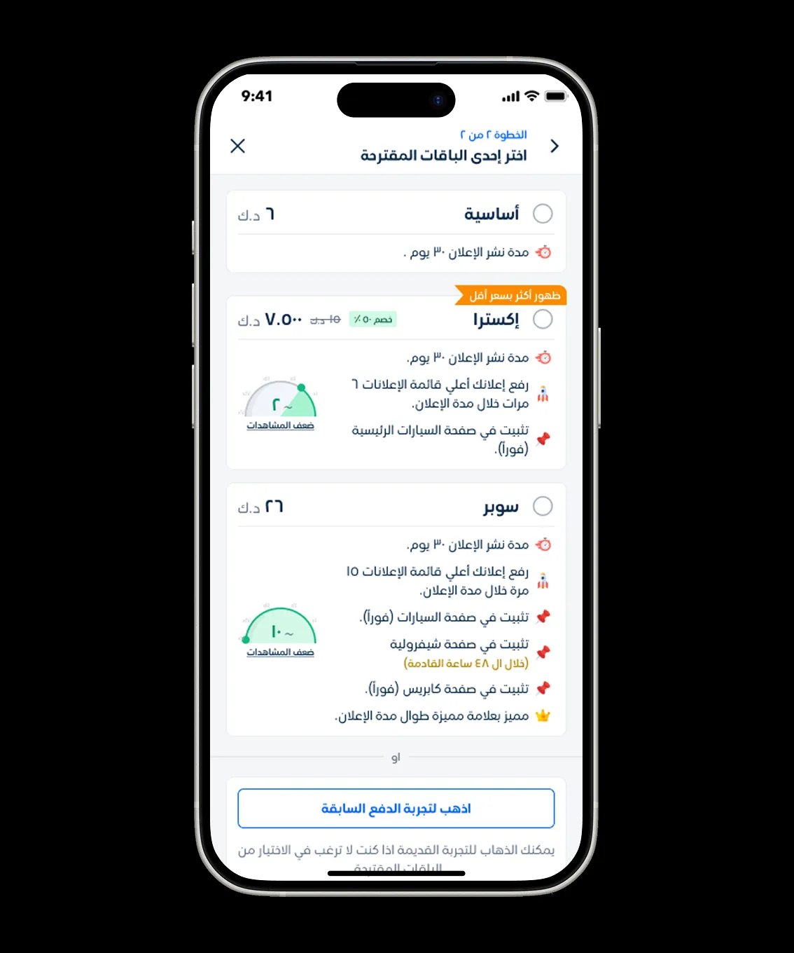
- Basic (1x): Standard entry with no add-ons.
- Extra (2x): Boosted reach for faster sales.
- Super (10x): Maximum visibility for high-priority listings.
3. Balancing risk and speed: the rollout strategy
Because this touched 4Sale's core revenue stream, we evaluated three distinct rollout options to balance business risk against launch goals:
- Standard A/B Test (PM suggestion): Splitting traffic 50/50. We rejected this because leadership required a full strategic pivot to the new model without maintaining split backend architecture long term.
- The Hard Switch Overnight (business request): Replacing the legacy page completely in one go. We rejected this due to high risk. Changing a live payment surface overnight could confuse existing power users, leading to drop-offs and an immediate revenue dip.
- The Safety-Net Hybrid (my suggestion): Shipped the new Bundles UI while embedding a real-time safety mechanism and fallback.
How the safety net worked:- Proactive Support Trigger: I designed a background drop indicator with a live timer. If a user stalled on the new screen beyond a specific duration without making a selection, an automated trigger notified our Customer Support team.
- Direct Onboarding Call: The CS team received the user's listing context in real time and reached out directly. They guided the user through the new options, helped onboard them to the concept of Bundles, and recommended the exact package suited for their specific ad.
- Legacy Safety Valve: We also kept a subtle link to the legacy experience at the bottom of the screen to give hesitant power users an immediate escape hatch.
The solution
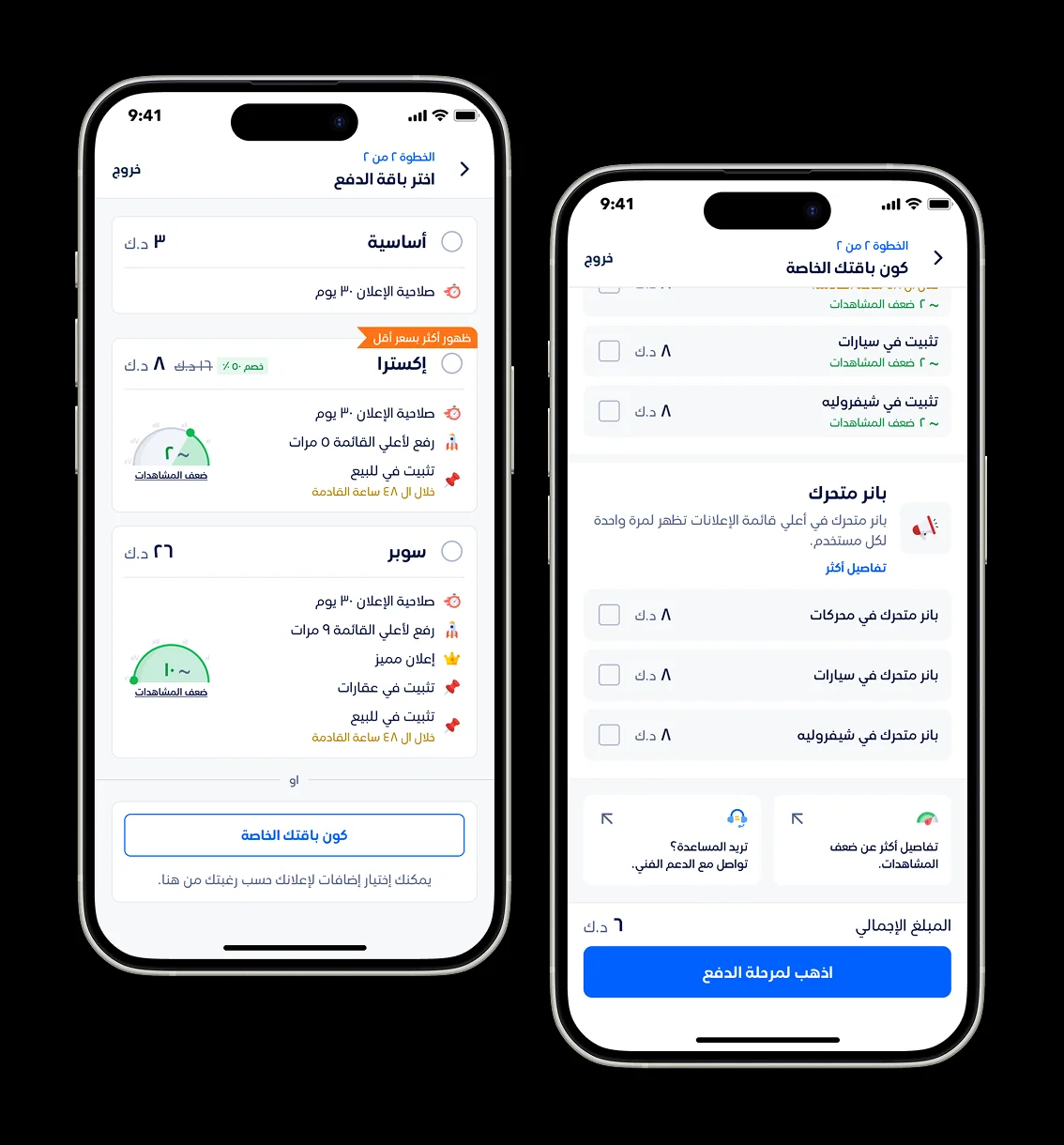
The final design collapsed the multi-step configuration into a single, outcome-driven screen.
Key design updates included:
- Reduced Cognitive Load: Combined Plan selection, Add-ons, and Confirmation into one clear decision point.
- Outcome-Oriented Copy: Shifted the language from technical specs like “Pin for 24h” to tangible results like “Get 10x more views.”
- A Built-in Safety Net: Integrated the background timer and CS signal trigger so support agents could step in right when users needed help.
- A Safety Valve Link: Included a direct fallback link to the legacy experience at the bottom of the screen to reassure power users who resisted change.
Impact
69%
Adoption in the first 3 months
+20%
Uplift in average revenue per user
Add-on adoption went from near-zero on the legacy page to 69% on Bundles. A payment step that used to leak revenue became one of 4Sale's primary monetization surfaces.
“An exceptional talent in UX and UI design. His ability to align design with strategic goals ensures every solution not only looks great but delivers real impact.”

Nahla Mortada
Product manager on Bundles at 4Sale
Reflection
If I were to iterate on this further, I would focus on the power users and business accounts who continued using the legacy fallback link.
While the new Bundles flow worked exceptionally well for standard users, power users still preferred the legacy Add-ons screen because they wanted precise control over individual boosters. Rather than maintaining the old screen indefinitely, a better solution would be to evolve the experience for them by introducing a customizable “Create Your Own Bundle” feature directly within the new architecture. This would give high-volume sellers the granular control they need without keeping technical debt from the legacy flow alive.